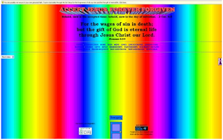
 Bad websites have the qualities contrary to well designed websites. Unorganized, cluttered information. Slow uploads, misspelled links, overuse of color and pattern are all examples of poorly designed websites. When i googled "what not to do when designing a website" the image to the left came up. It is a good example of bad choices of color! I found an example of overuse of pattern and unorganized information at http://www.thecountrygallery.net.
 As a new student to web design, it is my goal to design well organized clear websites and not chaotic confusing ones.

